After acquiring the company, TouchBistro needed to refresh the Reso website to fit the brand. This meant it was time for an update to the UX and UI.
Why?
To establish brand consistency, the site needed an overhaul in its design. This creates trust and loyalty within the users and see TouchBistro as an expert in restaurant business.

TouchBistro site as reference.
Original version of Reso.
RestoHub, another TouchBistro site.
Overview of project plan.Where did I come in?
I was assigned to redesign (UX and UI) the website, so I prepared a plan for myself to keep the project organized.
How did I get started?
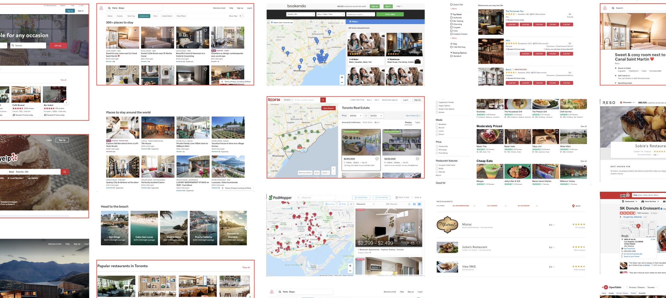
After reviewing the existing UX and UI, it gave me a good idea of how I needed to refresh the site to match the branding of TouchBistro. I also took inspiration from various sources.
Review of existing UI and other sites.
Sample of the design system.What was next?
The brand guidelines was already established so I took that and applied them as a design system to maintain consistency throughout the website.
-
![]()
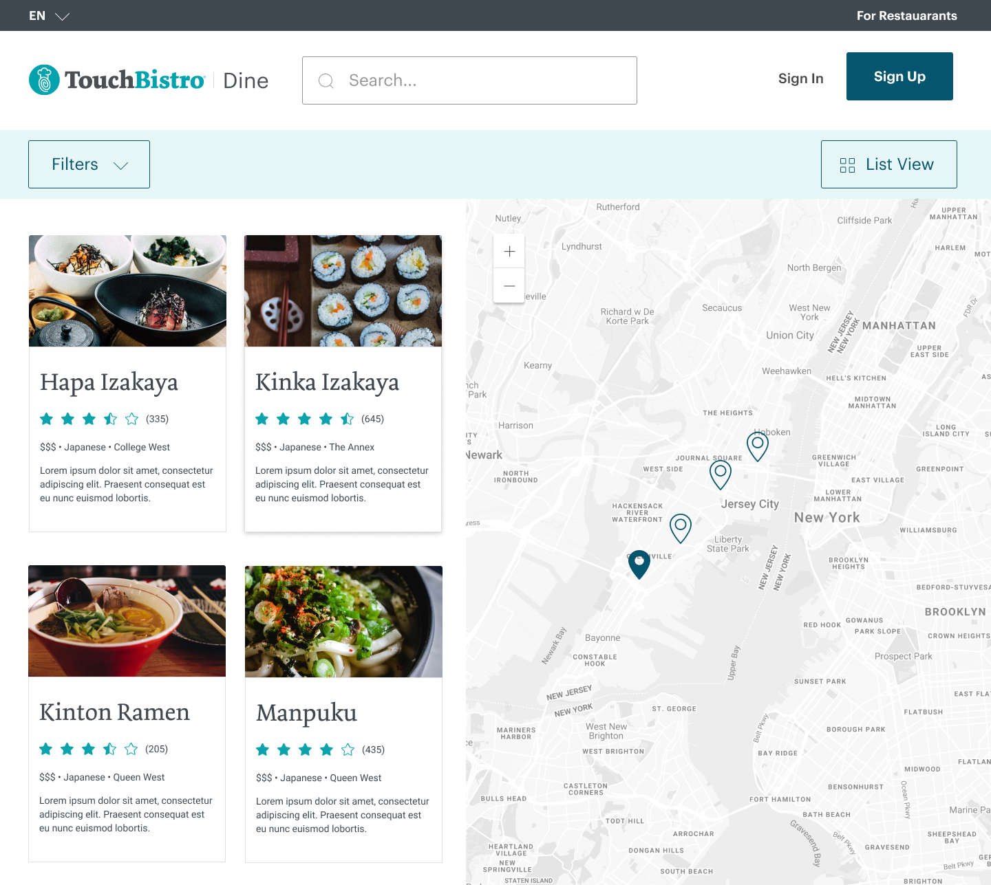
Cleaned up the home screen.
-
![]()
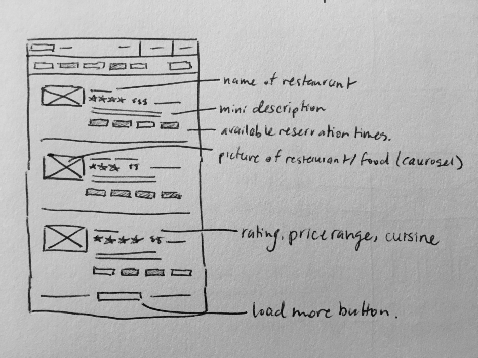
Made a more intuitive map view.
-
![]()
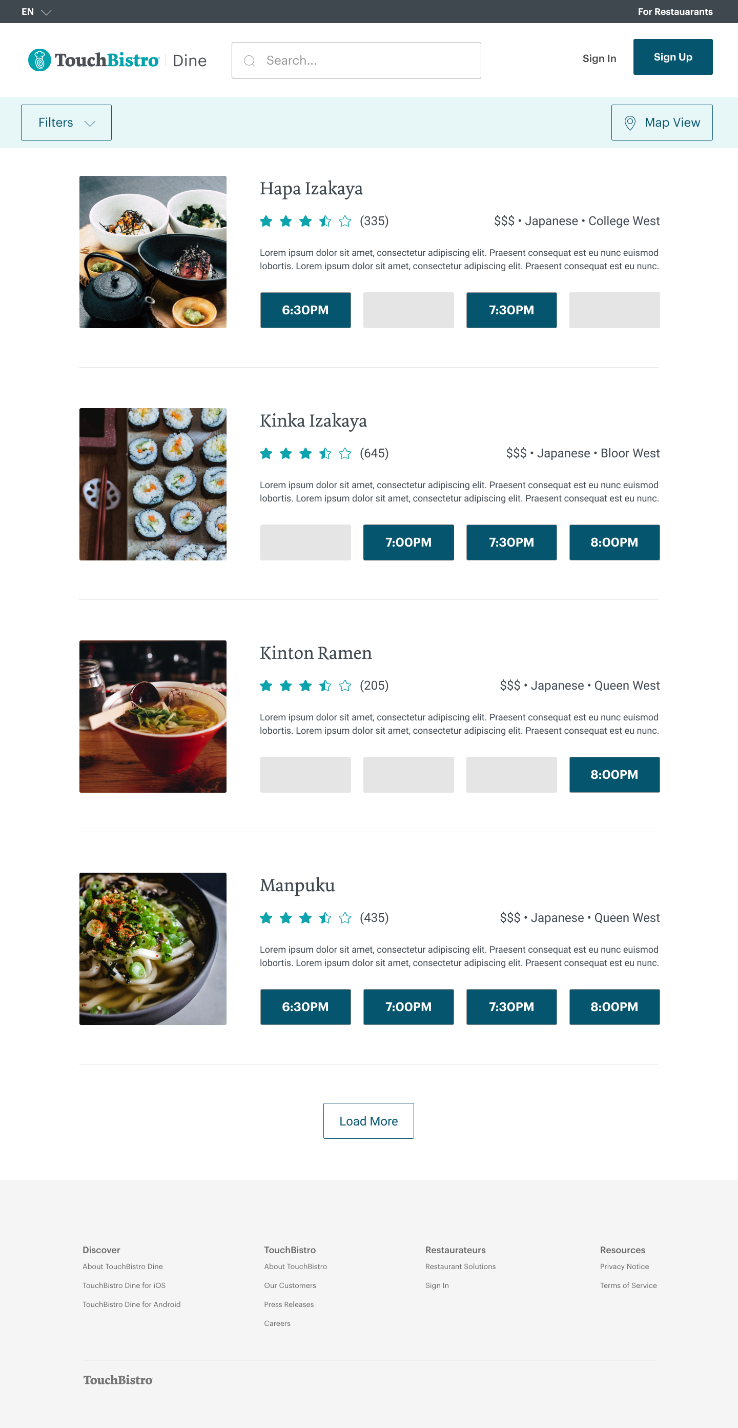
Provided the most critical information.
-
![]()
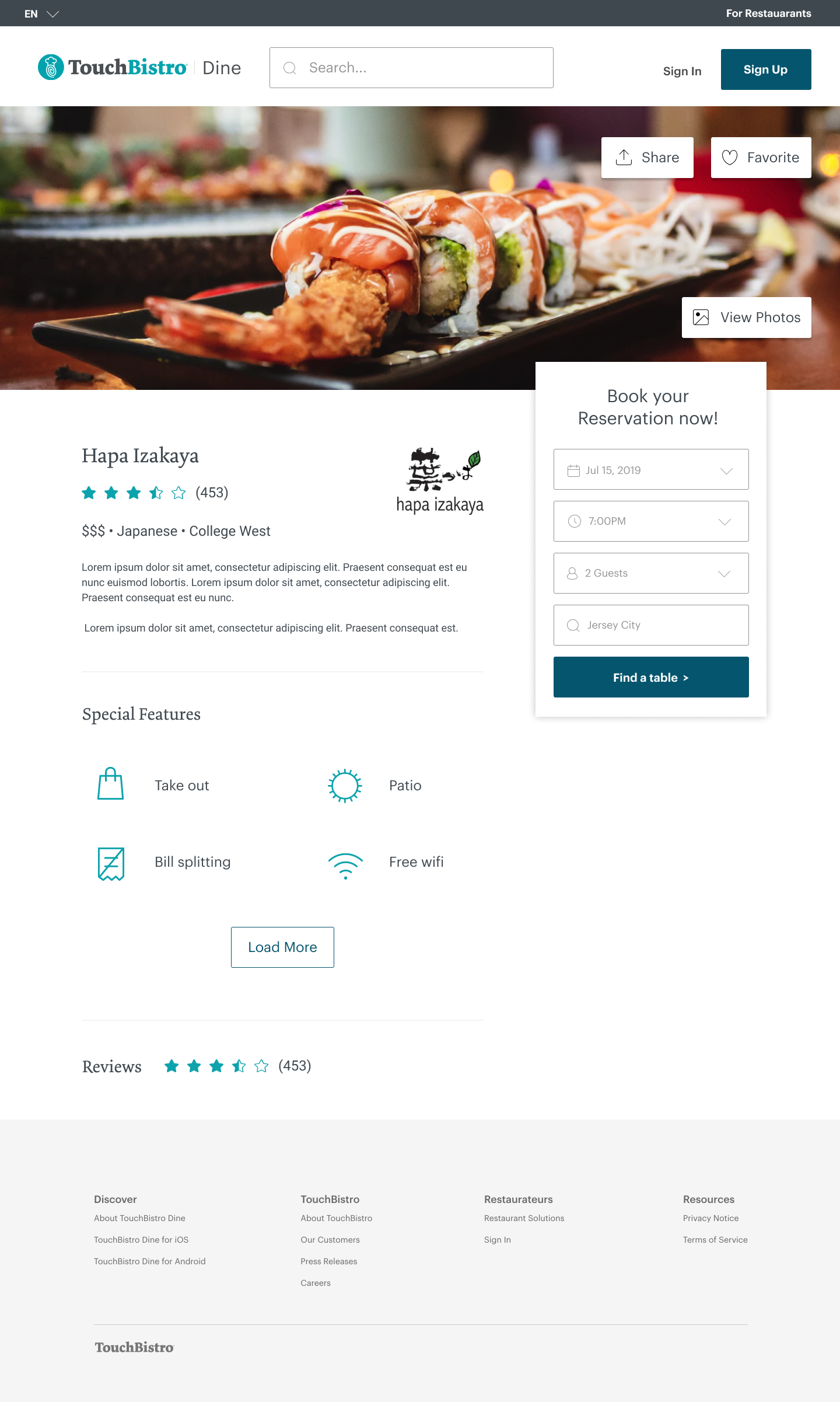
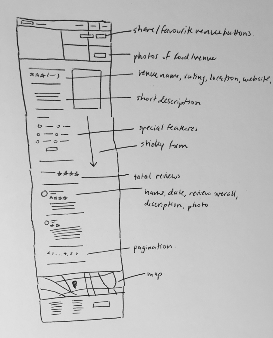
Created a flow to showcase details.
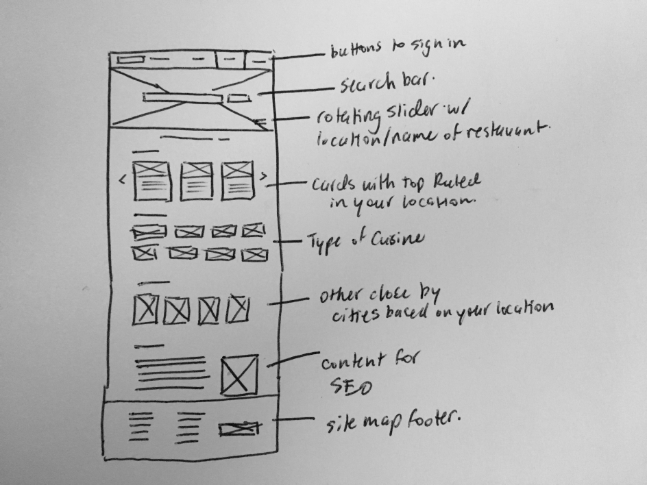

Home Page

Using imagery and colour, the hero becomes a clear CTA.1
With location services turned on, the site can provide local suggestions.2
Based on the user’s preference, they can select from cuisines.3
Opportunity to search via city if looking to make travel plans.4
Creating familiarity with the brand with a company bio.5