Remember The Girls, a nonprofit to help women with X-linked conditions, needed an updated brand identity and complete website overhaul.
Why?
There was an opportunity for improvement as the brand wasn’t effectively communicating their expertise in the field, and their website became static with outdated information.
Inconsistent styling, making it difficult to read and navigate.Branding is not responsive and no brand guidelines established.
Static content, making user engagement very low.Where did I come in?
I redefined their new look and rebuilt their entire website. From end to end, I created the brand identity, conducted the UX research, designed the UI, and developed the website.

Overall project overview & process.How did I do it?
It started with speaking to the community. Using an in-depth survey, I asked the primary and secondary audiences what they would find meaningful.
-
When it comes to rare X-linked conditions, “research and education” are top priorities for both women with X-linked conditions and medical professionals.
-
It was also requested to have “patient-friendly language” as the research is heavily worded with scientific jargon, leaving many women confused about their condition.
Medical professionals wanted a dedicated page to explain how X-linked conditions are inherited.
-
Finding people who understand the struggles of having a rare X-linked condition was important to the respondents.
-
The community identified they wanted to “feel connected” and “get involved” with the organization.

One of the many questions asked in the survey.What did I do with the results?
From the research, I created an outline listing all required pages—based on the previous site and the results received from the survey.

Rough outline for the new sitemap.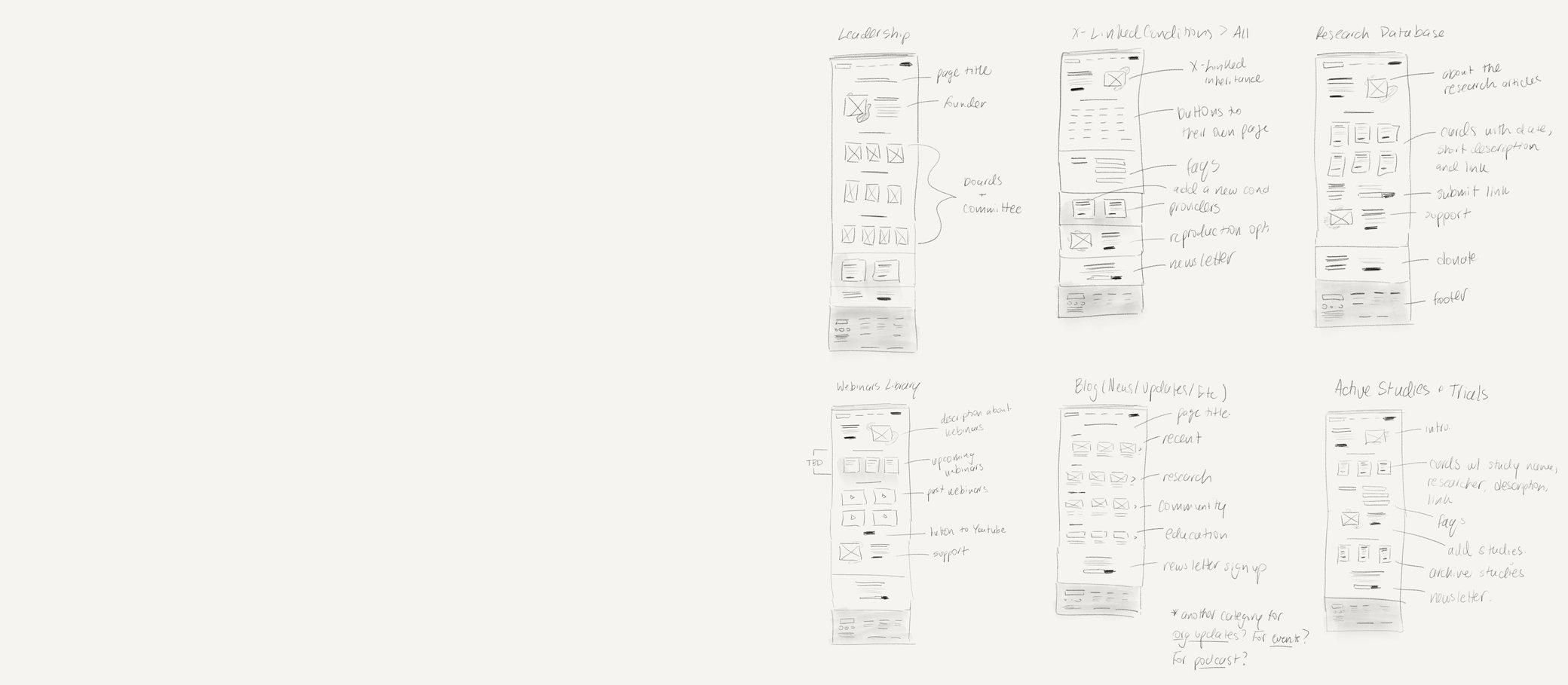

How did this help me?
This gave me a good idea of how many sketches I needed to draw. The wires consisted of reoccurring components—encouraging users to join the community, and ease of access to information.
Small sample of my rough sketches.What was next?
Using the new brand identity, I created a design system for both mobile and desktop mockups.
Contrasting colours, large font sizes, consistent visual hierarchy, and reoccurring components were all taken into consideration in this process.

Sample of the design system used for mockups.How did it come together?
With low code software and my knowledge of HTML/CSS, I developed the site.
This included SEO and other optimizations for performance.

Snippet of code used on the site.How did testing go?
After the site was built and the QA was complete, I conducted a usability test using 3 different prompts.
-
Device: Desktop
Summary: Alex proceeded with all 3 scenarios with ease in under 3 clicks using the search tool. The whole session was ~5 minutes in total.
Insight: Make sure the search tool functions correctly.
-
Device: Mobile
Summary: When working through the prompts, Andy used both the hamburger menu and the footer sitemap to navigate the site.
Insight: Some of the page names are not as clear as they could be.
-
Device: Desktop
Summary: Jess checked the home page first every time before looking through the navigation. She commented a lot about the order of lists.
Insight: Whenever possible, items should be listed in alphabetical order.
Home Page

Patient-friendly language and imagery throughout the site.1
Deep linking to various research and education for easy navigation.2
Outbound links to the support group to connect with others.3
Updated blog for community involvement and contributions.4
Opportunities to subscribe to the newsletter to stay engaged.5
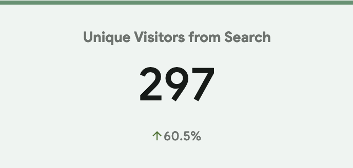
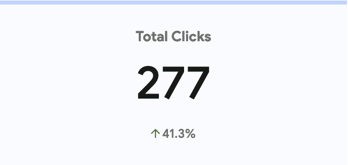
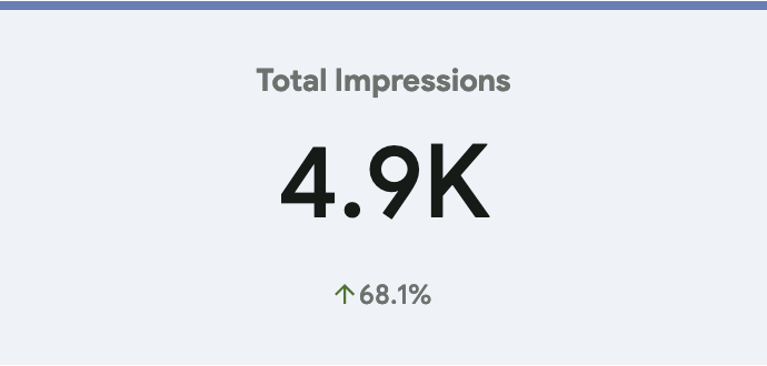
The results were overwhelmingly positive.
As a woman with an X-linked condition, working on this project meant a lot to me. When improved analytics and all the heartwarming feedback came pouring in, it was clear I made a huge impact.


What did I learn?
I’m glad you asked! I made a few assumptions on that were corrected after researching.
-
I thought more family members or loved ones of women with X-linked conditions would use the site, to learn more about these conditions. It was made clear by the survey that it’s mainly the females who are impacted by the conditions.
This helped dictate the type of imagery and colours I would use throughout the site.
-
The website is heavy with information, so I thought people would view it from a desktop. 75% of the community said they consume research on their mobile devices.
With this information, I knew optimizing mobile was important.
-
I made the assumption the donate button needed to be everywhere. In understanding the needs of the community, I learned they wouldn’t be donating.
I emphasized the newsletter sign up and joining with the support group instead.
-
One user surprised me during usability testing. I never use the “Search” functionality but this person used it for every prompt.
The tool worked as expected and the user was able to find the information I asked for, it was just unexpected.